Behind Our Worlds: Neptune
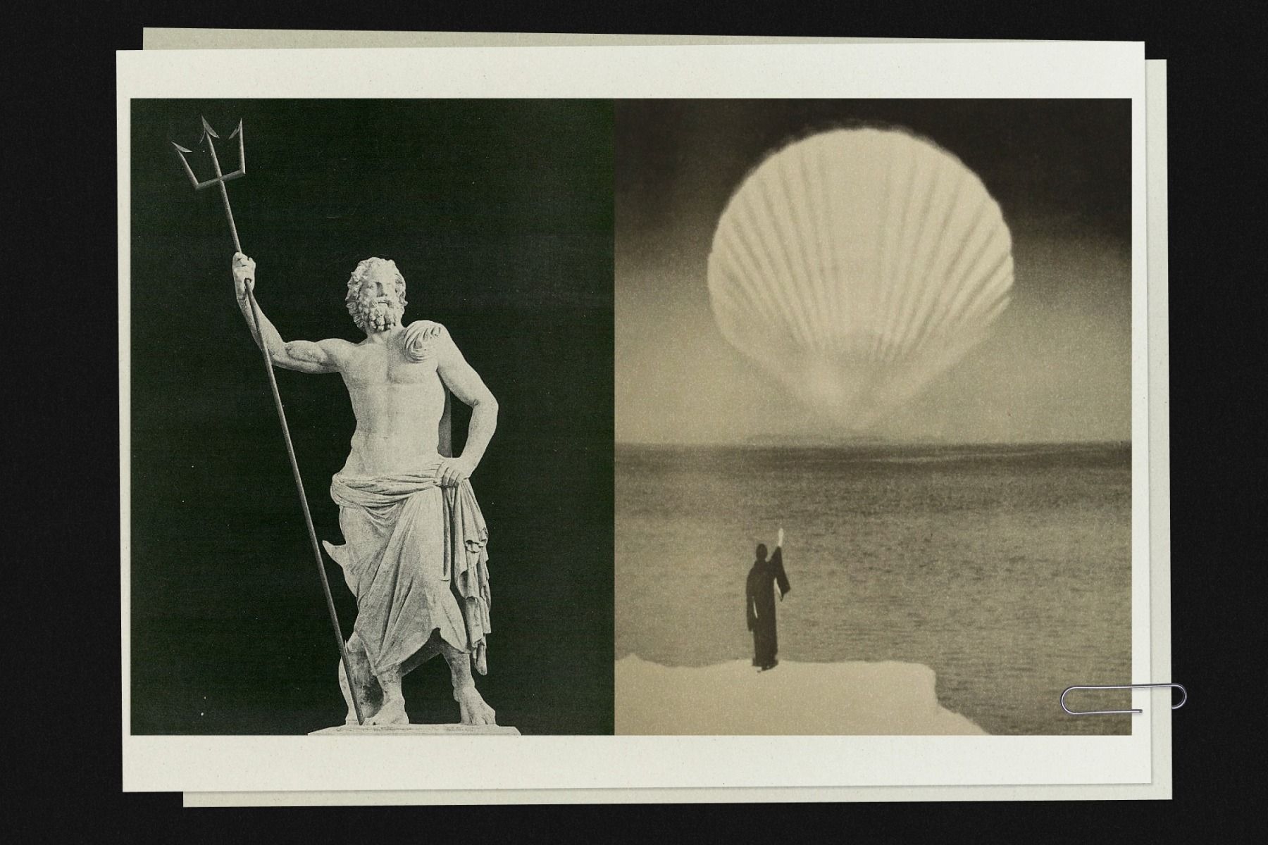
renaissance /ˈrenəˌsäns, -ˌzäns/ 21st century., n. 1. A reawakening. Rebirth. The act of remembering what is real. A cyclical uprising of truth, beauty, and being. syn: return, becoming, rewilding, deep breath, innate realignment. 2. A personal or collective bloom; the moment you recognize yourself again. A pulse beneath the surface.
For over a decade, The Dean stood at the corner of Fountain and Snow. Our very first Ash Hotel, born in the hipster era of early 2014 — a time when long beards, tattoos, and tote bags reigned supreme, and pour-over coffee was very much in vogue.
Since then, Providence (and the world) has changed, and we felt it was time to revisit the identity of our first Ash Hotel.
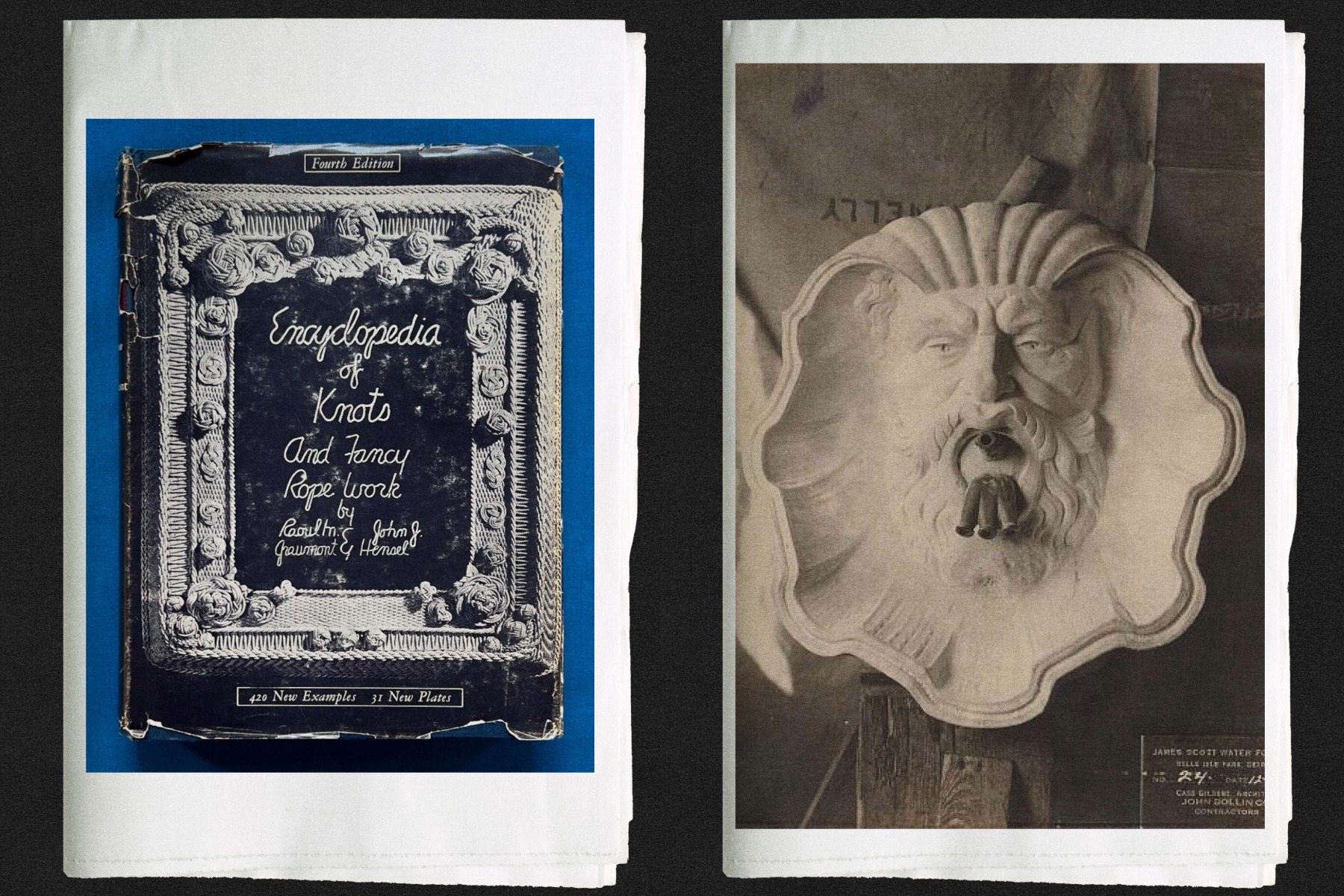
Built in 1912 as The Church House, 112 Fountain Street first served to provide lodging and support for sailors and stevedores — as huge steamships arrived from the ports of Europe carrying a generation of hungry young men, eager to make the most of this prosperous age of industry.
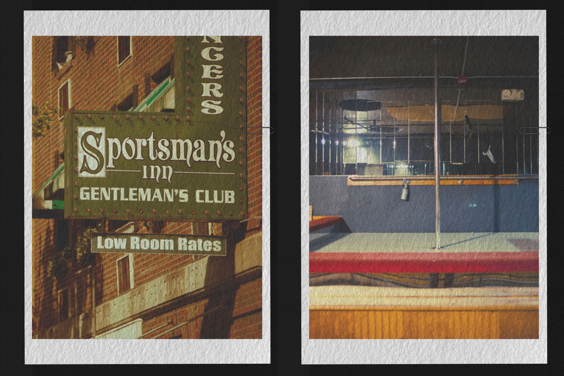
As downtown Providence declined after WWII, the property was sold and reimagined as a budget hotel with a reputation as a den of iniquity. After that, 112 Fountain Street was reborn as an Inn, then another, and another, and another, each slipping further into moral turpitude, establishing the property as a hotspot for crime and prostitution, housing drifters and vagabonds before shutting its doors for good in 2009. Following an extensive renovation and rehabilitation, The Dean Hotel opened in 2014.
 All this goes to say, our storied hotel has had many chapters, and it felt ready for the next. It was time to return to our seafarers' roots at the height of the Gilded Age. And so Neptune was born. Neptune, the Roman god of the waters, feared and loved by mariners and adventurers, protector of all that dwells beneath the waves — a fitting patron for a haven in Rhode Island’s prosperous port city.
Providence is an academic town, and naturally the tenor of the hotel reflects the distinctly clashing purposes of the guests: the excited anticipation of the arriving students, the wistful nostalgia of alumni returning years later, the feverish verve of the passionately studious, the pomp and circumstance of the parents, the vigor of those in for the big game.
The table at the back of the restaurant is occupied by the once-in-vogue art star turned adjunct printmaking professor and his favorite T.A. The king suite is reserved for a movie star in town to visit her daughter, a freshman up the hill. A gaggle of philosophy majors is shrieking along to “Like a Prayer” in a private karaoke room.
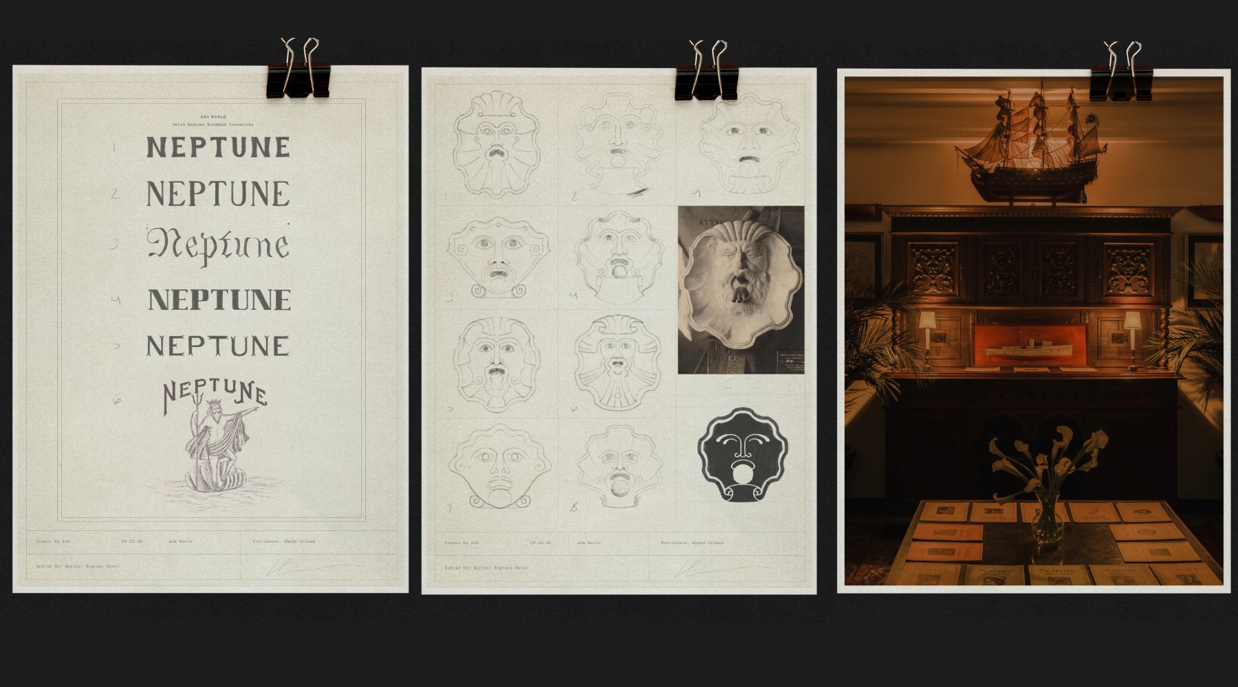 Neptune draws its creative direction from three overlapping strands of Providence’s identity: its long maritime history, its legacy of scholarship and academia, and the experimental arts culture that has always existed at their edges. The brand imagines these worlds colliding: a collegiate sailing club, an eccentric professor’s study, and an avant-garde theater company occupying the same old Providence building.
Its visual language moves between the seriousness of a leather-bound academic volume and the irreverence and absurdity of Ubu Roi: learned but never stuffy, historic without becoming nostalgic. References range from Take Ivy and collegiate sailing clubs to vintage yearbook collages, old oil paintings of roiled seas, Gorham silver paper templates, Saul Steinberg illustrations, and the accumulated visual world of archival National Geographic.
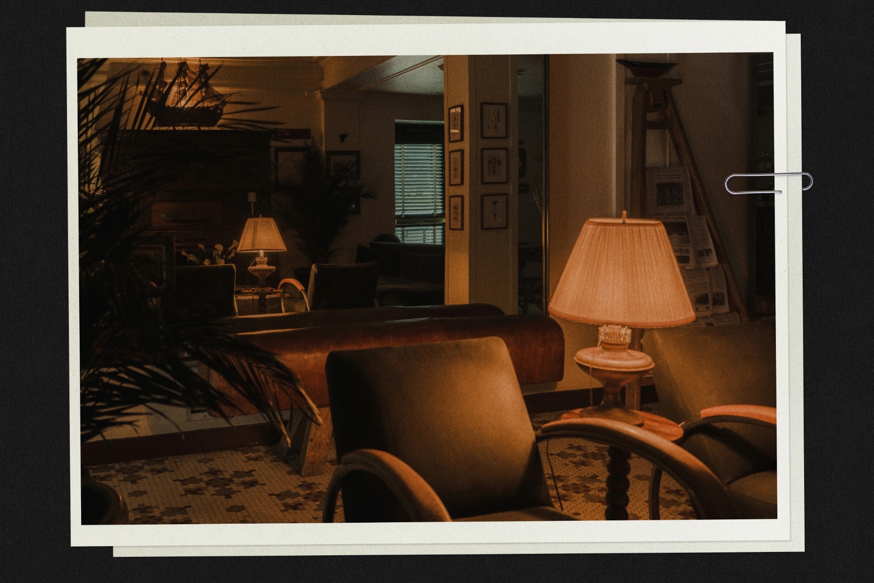
The identity itself is assembled from fragments of maritime ephemera and found history. Neptune’s icon is derived from an antique terracotta tile depicting the head of the sea god, reimagined as an oyster shell cradling a pearl, while the logotype takes its cue from an 1890s trademark for an oyster-canning company called “Neptune.” The palette similarly moves between the sea, the scholarly, and the unexpectedly vivid: the near-black blue of deep water, the chalky white of crushed shells, the electric blue of the planet Neptune, and the signal red of a sailboat’s pennant.
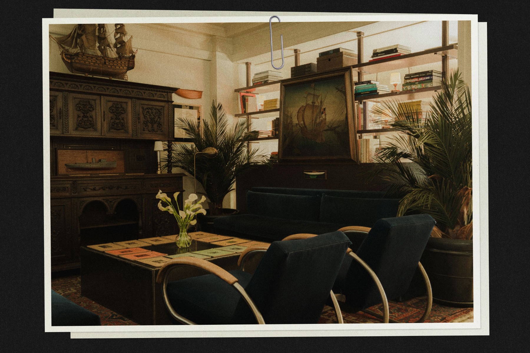
These references extend into the interiors as a layered rather than literal interpretation of Providence, maritime materials and objects, collegiate forms, archival graphics, patinated metals, dark woods, aged textiles, and moments of wit and surrealism. The result is intended to feel as though Neptune has always belonged to Providence, while remaining difficult to place in any single period.
—